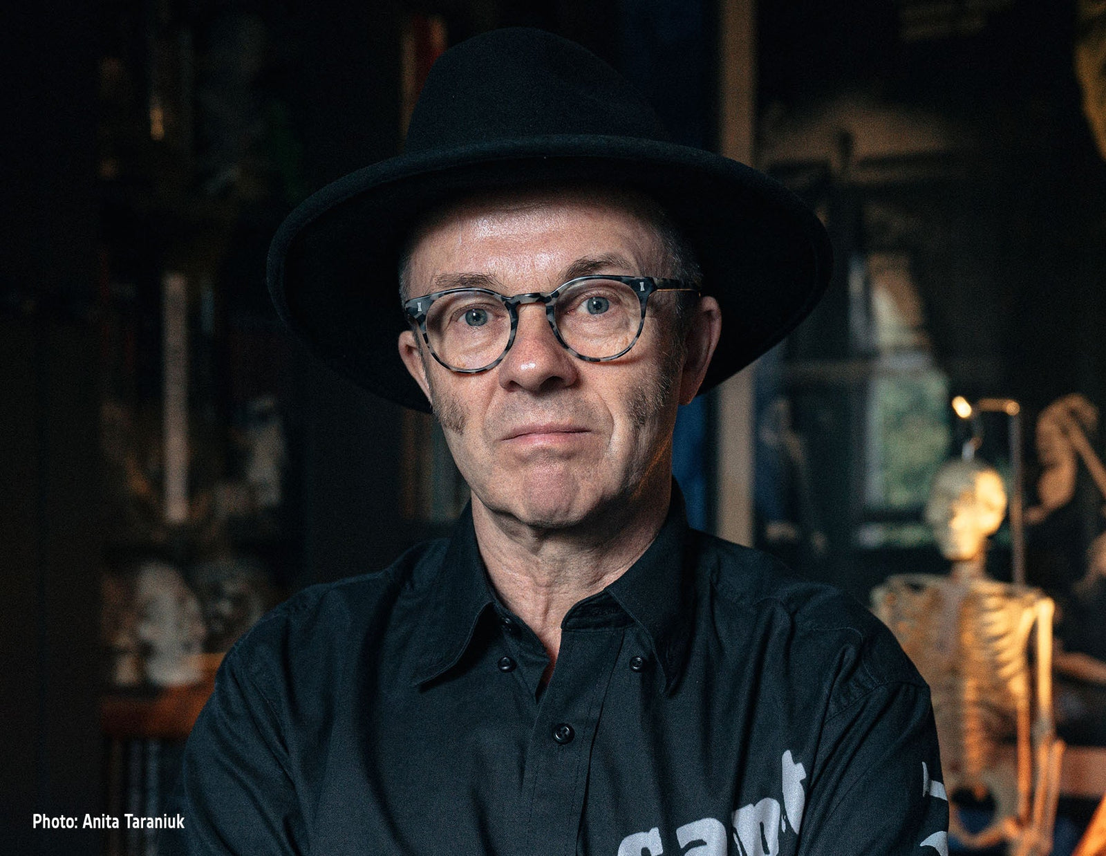
Captain Kronos Vampire Hunter: The Graham Humphreys Interview
The release of Captain Kronos Vampire Hunter in 4K is accompanied by a swathe of fresh material, including brand new artwork created by the renowned Graham Humphreys. Hammer News was delighted to catch up with Graham and chat to him about his work on the poster, his process, inspiration, and what makes Kronos such a special film.
We recently looked into Hammer’s history with film posters and both the original and latest artwork relating to Captain Kronos - Vampire Hunter (1974). Graham Humphreys was tasked with creating new visuals for this 70s classic and produced striking imagery that captures the story, its action and characters in a way that underlines its place within the pantheon of Hammer greats.

An illustrator and designer with over four decades of experience, Graham is best known for his work in the horror genre. He created the original, iconic posters for both the Evil Dead franchise and the Nightmare on Elm Street movies. He went on to work on hits including From Dusk till Dawn (1996), Rob Zombie’s House of 1000 Corpses (2003) and more recently, the BBC’s Inside No. 9, and he’s created a huge amount of incredible artwork for rereleases, festivals and spin-off merchandise.

He was influenced by the visuals of classic Hammer horror (‘…every time I’m painting something, at the back of my mind is Dracula Has Risen from the Grave!’) and his output remains striking and nuanced. In short, he’s one of the few artists who can legitimately be called a ‘legend’ of the film industry.
Hammer News: You’ve got a blank canvas (literally) and you’re looking to create artwork for a film like Captain Kronos - Vampire Hunter. How do you start? Do you watch the movie, reply on your pre-existing knowledge of it, check out previous artwork or are you guided by the client’s requests?
Graham Humphreys: Because I was already familiar with the film I had a good head start! However, I usually begin by looking at previous campaigns because I want to avoid repetition, instead preferring to offer a fresh perspective and a new look. This also involves rewatching the film at least three times. Firstly, to study the plot and understand the narrative, second to identify the key visual elements, third to make screen grabs of the specific portraiture and visual hooks that will become the basis for my concepts.
Clients generally trust my judgement, but I will always ask if there are specific requirements (or things to avoid!) In this instance, because Caroline Munro is still active on the convention circuit, her portraiture offered signing potential, so I knew she should feature prominently. Knowing that the film often got short shrift for not delivering Hammer’s typical vampire lore, I made a point of emphasising the elements that offered bite, literally!
HN: What’s unique about Captain Kronos, and how did you instil that into your artwork for the film?
GH: It is one of the more obvious deviations from Hammer’s more recognisable vampire output, that much of the film takes place in daylight, offering vibrant colour potential, something I wanted to reflect. I also wanted to explore the key character dynamics, achieved by specific expressions and eyelines.
HN: You’re well-known for using the traditional medium of gouache (a form of water-based painting that dates back over a thousand years) to create your artwork. Could you tell us what that is, and why it’s important to you?
GH: It really is down to my training at Art College, it became my default medium, particularly because of it’s versatility and economic application in pre-computer graphic design, advertising and illustration. As I’ve gained more experience, I’ve been able to develop my own techniques, they continue to evolve. Working efficiently and swiftly is key to meeting deadlines, gouache is a well suited medium because of it’s quick drying properties. The techniques also echo those of the past, yet offer both retro and contemporary properties.

HN: There’s a real beauty to a lot of your output. Which is more important - that lasting, intrinsic beauty, or the ability of your artwork to ‘sell’ a product? Or do the two go hand in hand?
GH: I would not be providing a professional service if the work did not sell the product, it is after all it’s primary purpose. However, within the professional service offered, I believe the work should also be able to stand alone as a product in itself. It is a constant challenge to deliver a commercial solution, whilst retaining the integrity of lasting art.
HN: Looking back on your gorgeous work on Captain Kronos, what did you enjoy most about creating it?
GH: It was a joy to paint Caroline Munro and pay my respects to the wonderful human being I’ve had the pleasure to meet on so many occasions. Naturally, I was also thrilled to work on a classic Hammer title - the horror film studio whose films inspired me to pursue this career! Additionally, the film underscores the incredible talents of Brian Clemens, whose work defines a very special part of British popular culture.

You can find out more about Graham’s work and history at his site, and the special, 4K release of Captain Kronos - Vampire Hunter is available now! You can also own the film’s limited edition poster featuring the brand new artwork by visiting Hammer’s online shop.
Thanks again to Graham Humphreys for his time and insight! We look forward to revealing more about Hammer’s next, hugely exciting collaboration with him very soon…


